Many mental states of distress may cause tunnel vision. When designing The Wellness Center’s outdoor spaces–including way-finding graphics and indoor signage, as well as digital experiences and printed material–I wanted to offer guidelines for those experiencing tunnel vision. These principles would enable Red Clay’s Vision Team to refine ideas and move forward on the overall design and planning of The Wellness Sanctuary.
To recap: this sanctuary will focus on assisting the Pike Creek/Newark, Delaware area community with a remedies for a variety of maladies. Below, I offer four principles to act as guidelines:
- Clear And Easily Readable Graphics and Symbols
- High-Contrast Narrow Color Palette Outdoors, Brighter Broader Primary Colors Indoors, More Progressive Color Palettes for Digital Materials
- Strong Simple Typography
- Direct, Caring and Compassionate Messaging and Tone
In all of the work that I do as a designer, I draw inspiration from the talented experts I have seen exhibited, worked alongside or had as mentors. In particular, for this project, I am focusing on the work done by designers Massimo Vingelli and Ladislav Sutnar for inspiration.

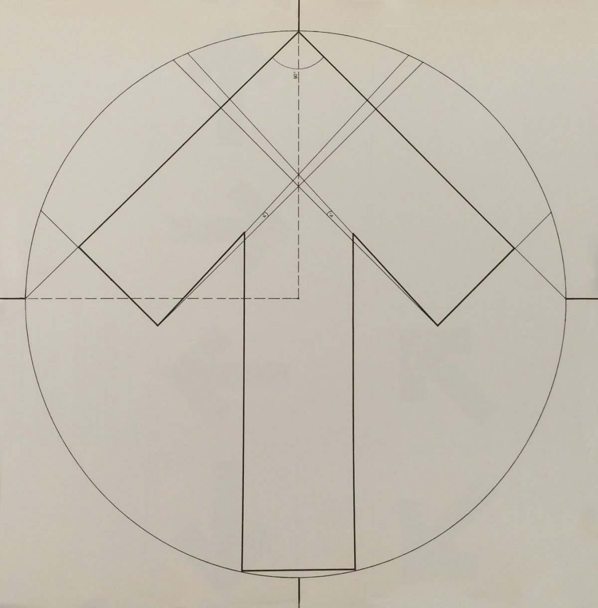
For the redesign of the New York City Subway System in 1972, Vingelli employs the Helvetica typeface and high-contrast colors to produce quiet symmetry with his way finding graphics, train classification symbols and informational posters.
As a child, reading these signs, and gaining direction from them was a seamless experience. After I learned the basics of the subway’s visual language, I was able to comprehend the complex network of information quickly and confidently with minimal effort. The major directional signage is all black with stark white Helvetica print and large, well-balanced, commanding arrows. The signs stand out against the white tile walls, the concrete stairs and the beige cement platforms. The size of these large black and white signs mirrors the size of the subway windows, and the smaller black and white detail signs provide more details pertaining to trains and routes.

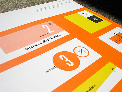
Ladislav Sutnar’s work is a new discovery for me. He is a master of information design. I would even give him the ad hoc title Grandfather of Modern Infographics and Flat Design. He uses color and shape more progressively than Vignelli does in his subway design work. His taste in typography is modern, with a Bauhaus feel. His graphics are mostly asymmetrical yet balanced, providing a flat visual hierarchy for readers.

As The Wellness Center develops its marketing materials, using a brighter color palette, and a more lively and affable graphic aesthetic and tone, may be a good way to broadcast its services to the community.
I’ve really just begun to think about how these guidelines and key examples may impact future deliverables, but it helps to keep them in mind.
To step back for a moment and think about how I am framing this case study, I have decided that I do not want to talk about “designing for mental illness.” This is a potentially draining, negative way to think about this project. Instead, I want think about designing for wellness, with a specific focus on the following question: How can graphics and tone used in a physical public space, in the more intimate space of a printed pamphlet, and in the general and multifaceted world of digital experiences, aid the healing process for those suffering under the weight of mental, physical or spiritual burdens?
I think I’ve begun to scratch the surface here with these guidelines, and I’m hoping others with similar design experience can give feedback, ideas and support on this journey.
In the next post I will give an update on how Delaware state and various nonprofits have begun to come together to support our cause.

