
I believe physical care, mental and spiritual health institutions will one day coexist in people’s minds and hearts as one concept and possibly even geographical location. We have already seen some global trends of wellness centers pointing toward this possibility. If Red Clay is to carry Jesus’s message of Compassion to all and stay socially relevant in modern life, we need to advance our ministry to accommodate and offer direct help for those who feel that their problems, soul sickness, ailments and situations are beyond help.
How to Design for Mental Illness (Pt.2)
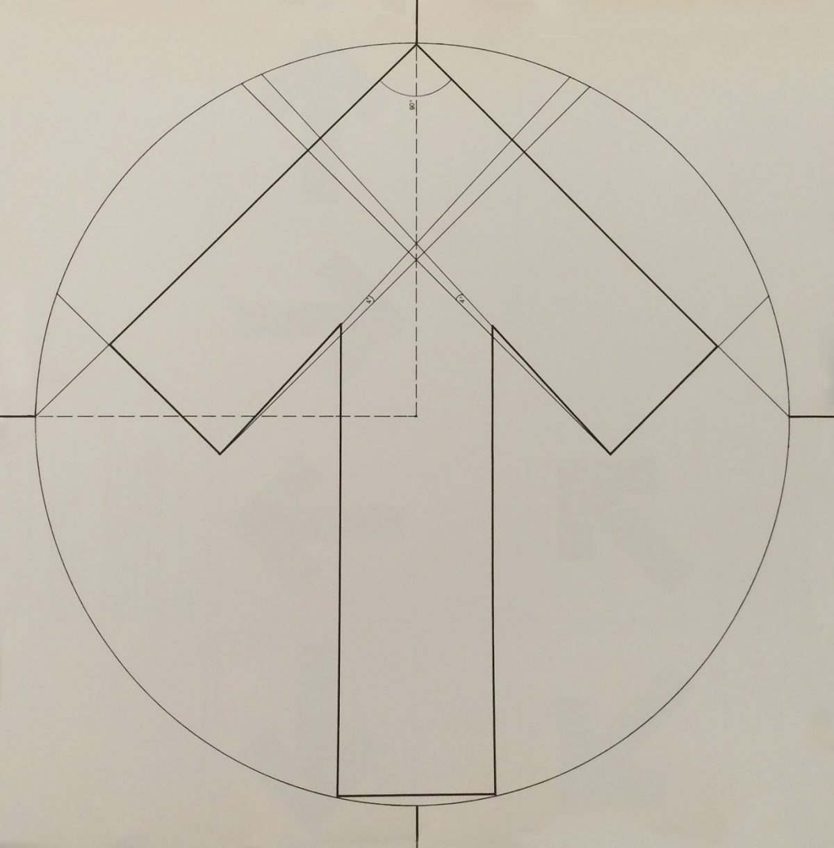
Many mental states of distress may cause tunnel vision. When designing The Wellness Center’s outdoor spaces–including way-finding graphics and indoor signage, as well as digital experiences and printed material–I wanted to offer guidelines for those experiencing tunnel vision. These principles would enable Red Clay’s Vision Team to refine ideas and move forward on the overall design and planning of The Wellness Sanctuary.
To recap: this sanctuary will focus on assisting the Pike Creek/Newark, Delaware area community with a remedies for a variety of maladies. Below, I offer four principles to act as guidelines:
- Clear And Easily Readable Graphics and Symbols
- High-Contrast Narrow Color Palette Outdoors, Brighter Broader Primary Colors Indoors, More Progressive Color Palettes for Digital Materials
- Strong Simple Typography
- Direct, Caring and Compassionate Messaging and Tone
In all of the work that I do as a designer, I draw inspiration from the talented experts I have seen exhibited, worked alongside or had as mentors. In particular, for this project, I am focusing on the work done by designers Massimo Vingelli and Ladislav Sutnar for inspiration.

For the redesign of the New York City Subway System in 1972, Vingelli employs the Helvetica typeface and high-contrast colors to produce quiet symmetry with his way finding graphics, train classification symbols and informational posters.
As a child, reading these signs, and gaining direction from them was a seamless experience. After I learned the basics of the subway’s visual language, I was able to comprehend the complex network of information quickly and confidently with minimal effort. The major directional signage is all black with stark white Helvetica print and large, well-balanced, commanding arrows. The signs stand out against the white tile walls, the concrete stairs and the beige cement platforms. The size of these large black and white signs mirrors the size of the subway windows, and the smaller black and white detail signs provide more details pertaining to trains and routes.

Ladislav Sutnar’s work is a new discovery for me. He is a master of information design. I would even give him the ad hoc title Grandfather of Modern Infographics and Flat Design. He uses color and shape more progressively than Vignelli does in his subway design work. His taste in typography is modern, with a Bauhaus feel. His graphics are mostly asymmetrical yet balanced, providing a flat visual hierarchy for readers.
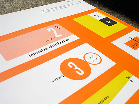
As The Wellness Center develops its marketing materials, using a brighter color palette, and a more lively and affable graphic aesthetic and tone, may be a good way to broadcast its services to the community.
I’ve really just begun to think about how these guidelines and key examples may impact future deliverables, but it helps to keep them in mind.
To step back for a moment and think about how I am framing this case study, I have decided that I do not want to talk about “designing for mental illness.” This is a potentially draining, negative way to think about this project. Instead, I want think about designing for wellness, with a specific focus on the following question: How can graphics and tone used in a physical public space, in the more intimate space of a printed pamphlet, and in the general and multifaceted world of digital experiences, aid the healing process for those suffering under the weight of mental, physical or spiritual burdens?
I think I’ve begun to scratch the surface here with these guidelines, and I’m hoping others with similar design experience can give feedback, ideas and support on this journey.
In the next post I will give an update on how Delaware state and various nonprofits have begun to come together to support our cause.
How to Design for Mental Illness (Pt.1)
The title of this post is more of a question.
How does one design for mental illness, and its dark siblings, depression, addiction, and grief?
To attempt to help answer how, I’ve offered my experience and skills as a designer, educator, and project leader to help develop a Wellness Sanctuary at Red Clay Creek Presbyterian Church.
Here is part of the process we’ve been going through since last October:
1. Define What The Church Represents to Itself, the Congregation and the Community
We held an archetype workshop defining Red Clay as having a Caretaker / Outlaw archetype. This enabled us to discern a tone for communication channels and focus on four key themes for our work in general below :
- Impactful reintroduction to the neighborhood
- Developing new worshiping communities
- Creating a sanctuary for those with mental illness, addiction, etc.
- Establishing a welcoming campus
2. We Organized Interested Parties under the areas they felt called to, assigning a team lead to each .
3. We Gathered Broader Groups of Those with Experience and Insight
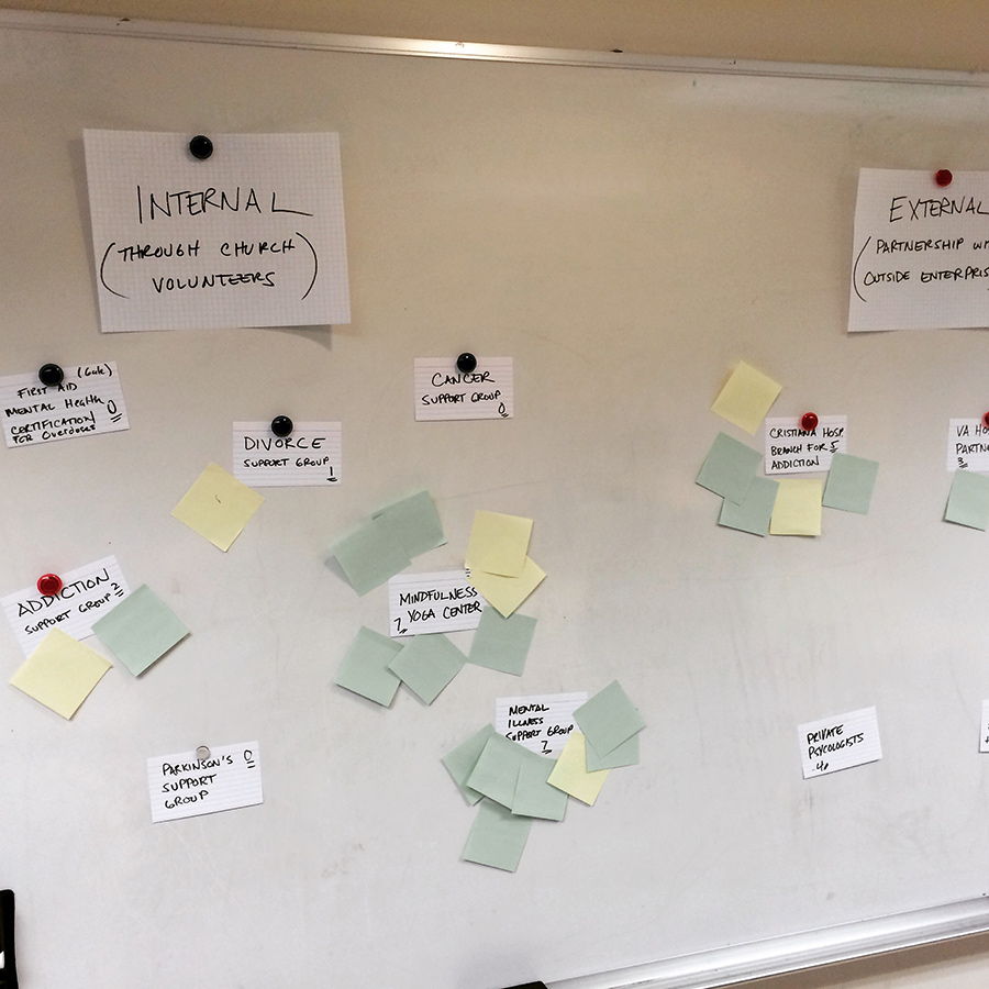
The pastors gathered congregation members with personal experiences ranging from divorce to depression to a wide variety of addiction problems, and openly discussed possible ways to support people who suffer in the future. Some of the areas they potentially were deeply committed to include:
Category 1: Internal (easily started by church volunteers)
- Cancer support group
- Divorce support group
- Addiction support group
- Parkinson’s support Group
- First Aid for Overdose Intervention
- Mental health support group
- Wellness / yoga / dietary support center
Category 2: External (requires partnership with outsider enterprise / facility)
- Partner with private psychologists allowing office hours at Red Clay
- Partner with Christiana Hospital for a Behavioral Health branch office at Red Clay
- Partner with University of Delaware Public Health and Psychology Internship program
- Partnership with N.A.M.I. or Meadowood Detox
- Partnership with VA Hospital and or Strong Bonds
4. Narrowed Down Ideas
We gathered again as group and assigned points to the above ideas. Each post-it note represented one point. Those ideas that were not assigned any points by the group were shelved, at least for now.

I tallied the voting and reached out to those unable to attend and spoke with 3 people directly on the phone for feedback.
Below are the results, the numbers after the topics are the scores. Every participant had three points to distribute in both categories mentioned above, totaling six points to use. My only rule was that you couldn’t use all three points on one topic. This was to prevent any landslides and potentially emotional voting. Here’s the results:
- General Mental Illness (Depression, Suicide, Family Issues) Support Group: 10 points
- Wellness, Yoga, and Dietary Support Center: 10 points
- Private Psychologist Partnerships: 8 points
- Partnership with Christiana Hospital: 7 points
- VA Hospital / Strong Bonds Partnership: 3 points
- General Addiction Support Group: 3 points
- Partnership with NAMI: 2 points
- University of Delaware Intern Partnership: 2 points
- Cancer Support Group: 2 points
5. Reach Out to Those with Professional Experience and Connections
Red Clay Creek is a very inclusive church with devoted professionals and volunteers from all backgrounds. Over the last couple of weeks I have spoken to a small eclectic group of people who are offering their professional and government connections. Next steps are to reconvene with a civic leader and a volunteer psychologist from within the church. This will be a general meeting with one agenda: How should we best integrate the areas our congregation is concerned about within the current Red Clay facility?
Next I’d like to explore copy, graphics and color for the distressed and mentally ill.